
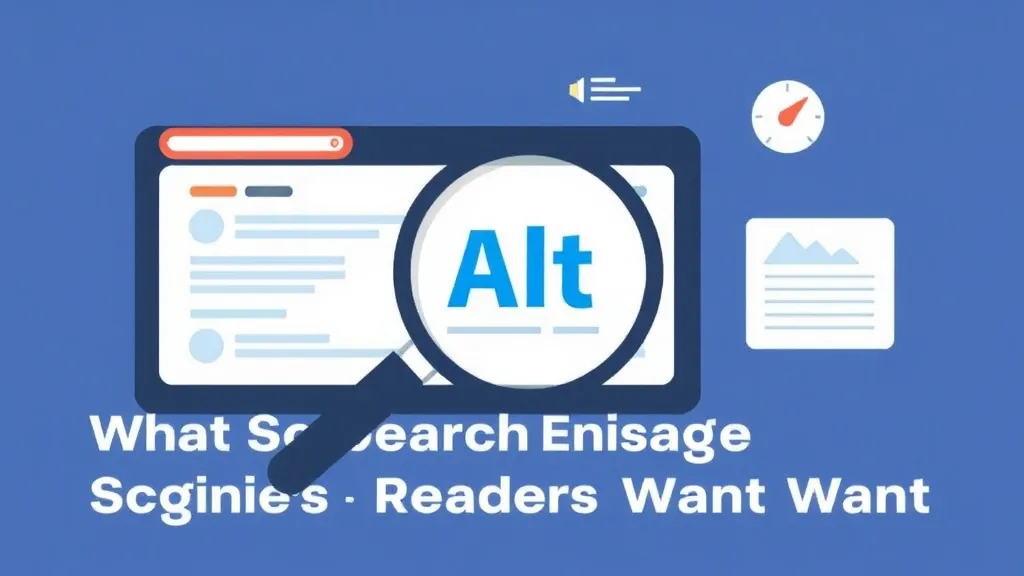
Image Alt Text: What Search Engines and Screen Readers Want
Alt text is one of those WordPress fields everyone fills in carelessly and almost nobody understands precisely. The Media Library presents you with four text boxes, three of which are decoys for this purpose, and the one that matters behaves in ways that trip up even experienced site owners. Get it right and you satisfy two demanding audiences at once: a screen-reader user navigating your post with their ears, and Google Images deciding whether your photo deserves to rank. Get it wrong and you either fail a Level A accessibility requirement or feed the search engine noise. Here is what each side actually wants, and how WordPress specifically helps or sabotages you.
The four Media Library fields, and why only one is alt text
When you upload an image in WordPress, the attachment details panel gives you Alt Text, Title, Caption, and Description. They are not interchangeable, and confusing them is the most common mistake I see.
- Alt Text becomes the
altattribute on the<img>tag. This is the one screen readers announce and the one Google reads as the image's primary text signal. It is the only field here that does accessibility or image-SEO work. - Title populates a
titleattribute, which renders as a tooltip on hover. Screen readers largely ignore it, mouse-only users rarely see it, and touch users never do. WordPress auto-fills it from the filename, which is why so many sites ship images titled img-4523. Treat it as near-useless and don't rely on it. - Caption renders as visible text below the image inside a
<figcaption>. It's editorial, not assistive — useful for credits or context, but it does not replace alt text. - Description only appears on the standalone attachment page, a page most sites should disable or redirect entirely. For 99% of installs it does nothing.
If you only ever touch one field, make it Alt Text. The rest are optional polish.
The insert-time copy gotcha that breaks bulk edits
Here's the WordPress behavior that catches almost everyone. When you insert an image into a post, the alt text from the Media Library is copied into the block at that moment. It is not a live reference. If you later open the Media Library and improve the alt text on that image, posts where you already placed the image keep the old (or empty) value.
This means a "fix all my alt text in the Media Library" afternoon does nothing for content already published. To actually fix a live post you have to edit the image block inside that post. Bulk alt-text plugins that write only to the Media Library record share this limitation — they prepare future insertions but leave existing posts untouched unless they also rewrite post content. Check that distinction before you trust any automation to have fixed your site.
What screen readers actually do with the alt attribute
Screen readers — NVDA and JAWS on Windows, VoiceOver on macOS and iOS, TalkBack on Android — encounter your image and announce something like "graphic, " followed by your alt text. That word "graphic" is the role; your alt text is the content. So writing alt text that starts with "Image of…" or "Photo of…" produces "graphic, image of a sunset," which is redundant and slightly insulting to the listener. Describe the content directly.
The decision that matters most is informative versus decorative:
- An informative image — a screenshot demonstrating a setting, a photo that is the subject of the paragraph, a chart carrying data — needs alt text that conveys the same information a sighted reader gets. A revenue chart's alt text should state the trend and key numbers, not say "revenue chart."
- A decorative image — the stock laptop-on-a-desk hero, a divider flourish, an icon sitting next to a text label that already says the same thing — should have an empty alt attribute (
alt=""). That tells the screen reader to skip it silently instead of reading a filename.
This is not stylistic advice. WCAG 2.1/2.2 Success Criterion 1.1.1 (Non-text Content) is Level A, the baseline conformance level, and it requires exactly this: text alternatives for informative images, and an empty alt for decorative ones. Missing or wrong alt text is a genuine compliance failure, which matters increasingly for businesses subject to ADA or the European Accessibility Act.
The block editor does this correctly — page builders sometimes don't
In the WordPress block editor (Gutenberg), leaving the Image block's alt field blank produces a true alt="", which is the correct, accessible outcome for a decorative image. Good default behavior.
Page builders are less trustworthy. Elementor, Divi, and Beaver Builder have, in various versions, fallen back to injecting the image filename or the Media Library title into the alt attribute when you leave it blank. The result is a "decorative" image that announces hero-banner-final-v2-compressed to every screen reader user. If you build with one of these, spot-check the rendered HTML of a decorative image to confirm you actually got alt="" and not a filename surprise.
What search engines want — and how much it's worth
For Google, alt text remains the primary text signal for Google Images, but it is not the only one and you should not oversell its ranking value. Google assembles its understanding of an image from several inputs:
- The alt attribute — the most direct description you control.
- The filename — wordpress-cache-settings.jpg gives Google a working hypothesis before it reads anything else; IMG_4523.jpg gives it nothing. Rename files before uploading, because WordPress derives the URL slug from the filename and won't fix a bad one for you.
- Surrounding text — Google associates an image with the paragraph it sits in. An image about caching dropped into a paragraph about security gets muddled signals.
- Structured data and on-page context — captions, nearby headings, and image schema all contribute.
Because alt text is read by both audiences, the keyword question answers itself: include your target keyword only when the image genuinely depicts it. "WP Rocket object-cache dashboard showing a 94% hit rate" is honest and keyword-rich because the screenshot really shows that. Stuffing your money keyword into the alt of an unrelated stock photo helps neither audience — the screen-reader user gets a lie, and Google's image models recognize the mismatch and discount it.
WordPress-specific cases worth knowing
WooCommerce product images: these feed Google Shopping and product image search, so alt text describing the actual product — color, material, model — earns its keep here more than anywhere. The product title is not automatically the alt text.
Lazy loading: WordPress adds loading="lazy" to images by default. It defers loading but does not touch the alt attribute, so it has no effect on accessibility or how Google reads your alt text. Don't let anyone tell you lazy loading "breaks" alt text — it doesn't.
AI alt-text plugins: tools that auto-generate alt via vision models can clear a backlog of empty fields fast, and several SEO plugins will auto-populate alt from the filename. Both are starting points, not finished work. Auto-generated alt is frequently generic ("a person sitting at a table") and misses the contextual point of why the image is on your page. Review and edit; never bulk-publish machine alt unread.
Complex charts: one field isn't enough
A multi-series graph or a labeled architecture diagram cannot be fully described in the ~125 characters that screen-reader convention suggests for comfortable listening (that figure is a guideline, not a hard limit). The documented accessibility pattern is a short alt text summarizing the image, plus a longer text description placed visibly nearby in the page body. Most WordPress themes give you no structured "long description" field, so simply write a paragraph beneath the chart: "The chart tracks signups from January to December, rising steadily until a sharp Q4 jump after the pricing change." That paragraph serves the screen-reader user, gives Google indexable context, and — bonus — helps every sighted reader who would otherwise have squinted at the axis labels.
Do this consistently and your images stop being dead weight. They become accessible to people who can't see them and legible to the engine that decides whether anyone finds them at all.
Site
Tools
We do not sell your email. We do not spam.
© 2026 RevealTheme. All rights reserved.